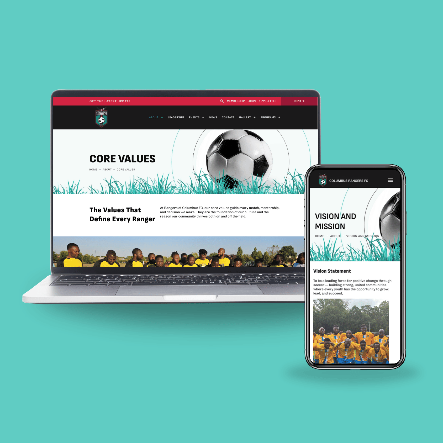
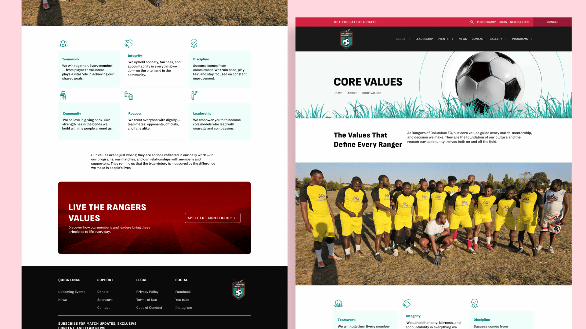
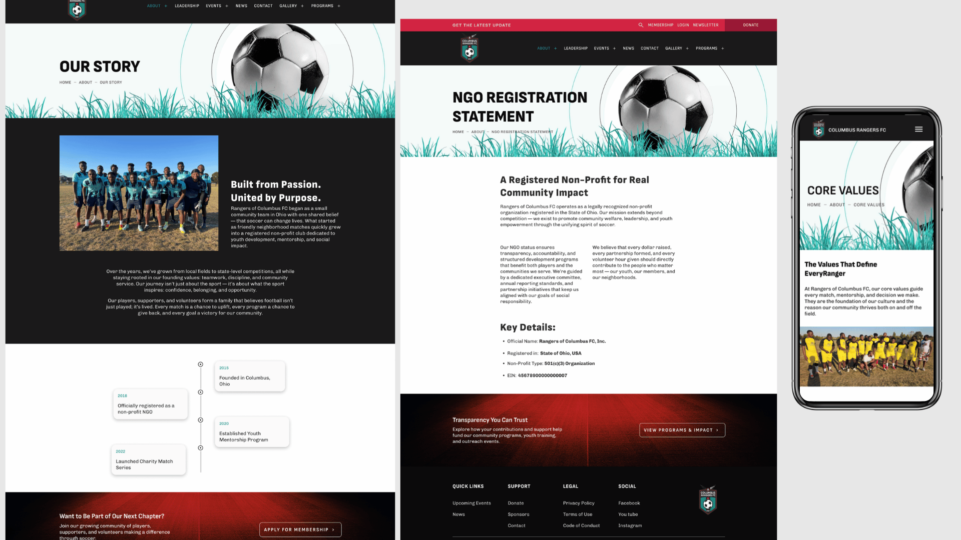
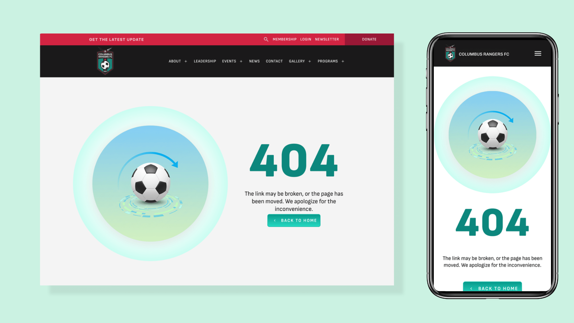
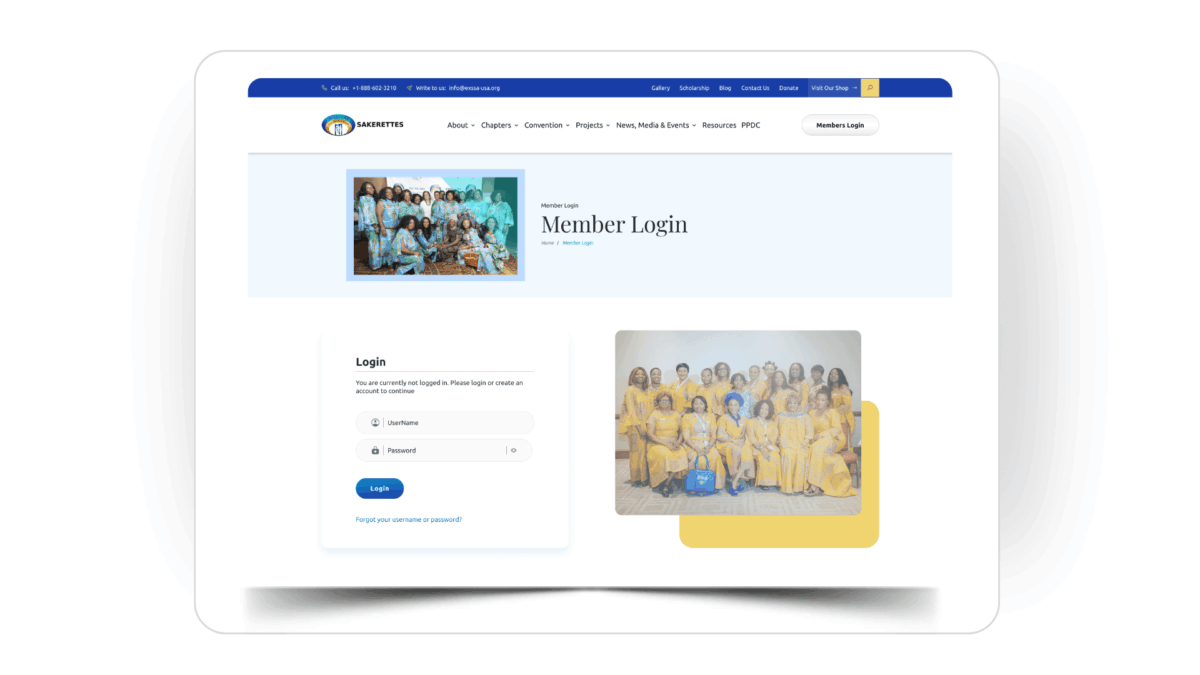
I collaborated on the UX design of the Rangers FC platform, which includes both a public-facing website and an internal admin dashboard. The platform was designed to support community engagement, streamline operations, and improve access to key information such as programs, events, and member interactions.
The goal was to create a seamless and user-friendly experience across both environments, ensuring clarity, ease of use, and efficient navigation.
My Contribution
As part of the design team, I contributed to the design of multiple screens across both the website and the admin dashboard.
My work focused on:
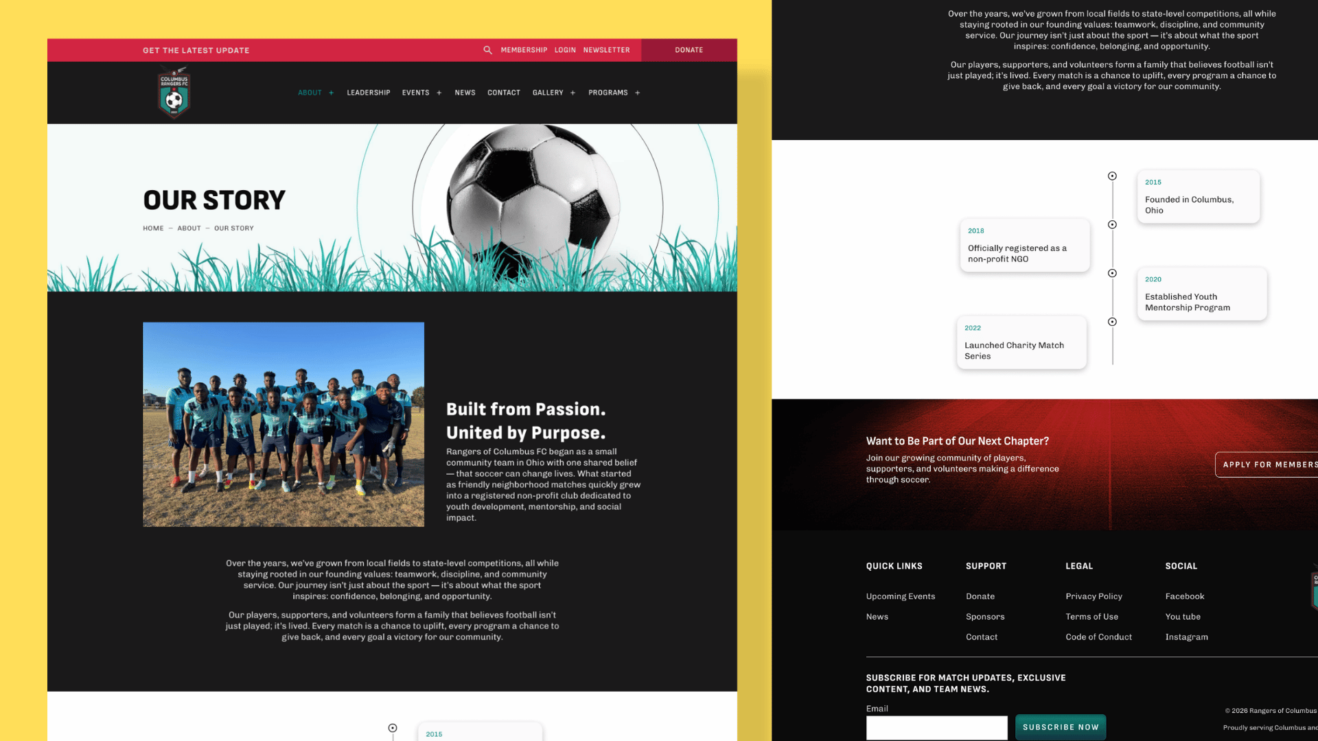
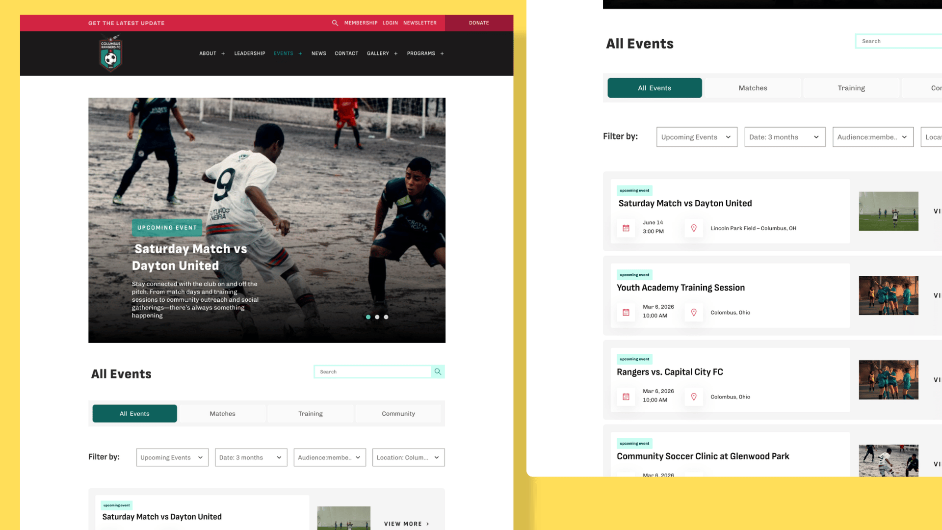
Structuring content-heavy pages for clarity and readability
Designing intuitive user flows for both public users and administrators
Creating consistent and user-friendly interfaces across different parts of the platform
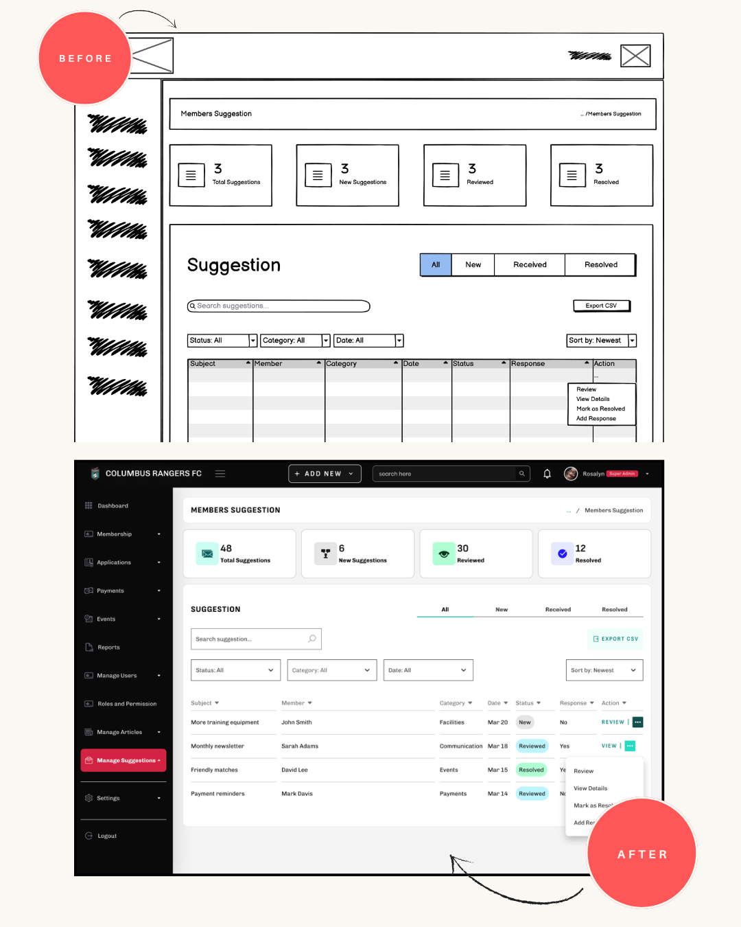
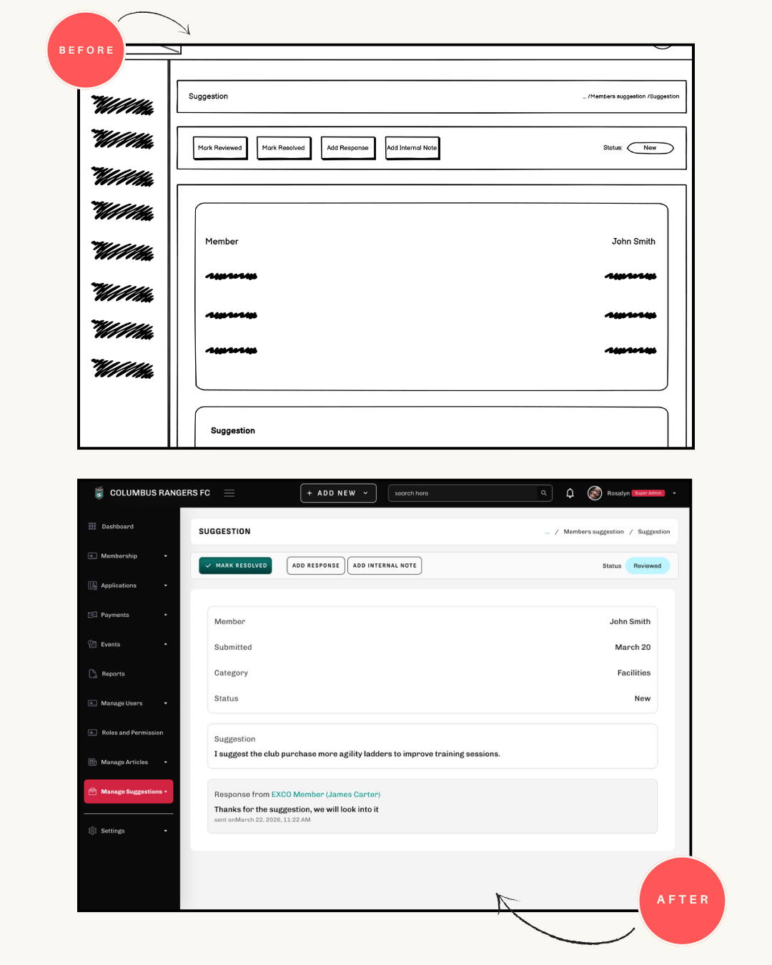
On the dashboard side, I worked on features that enable administrators to manage and review member interactions, including tracking and reviewing suggestions submitted by members.
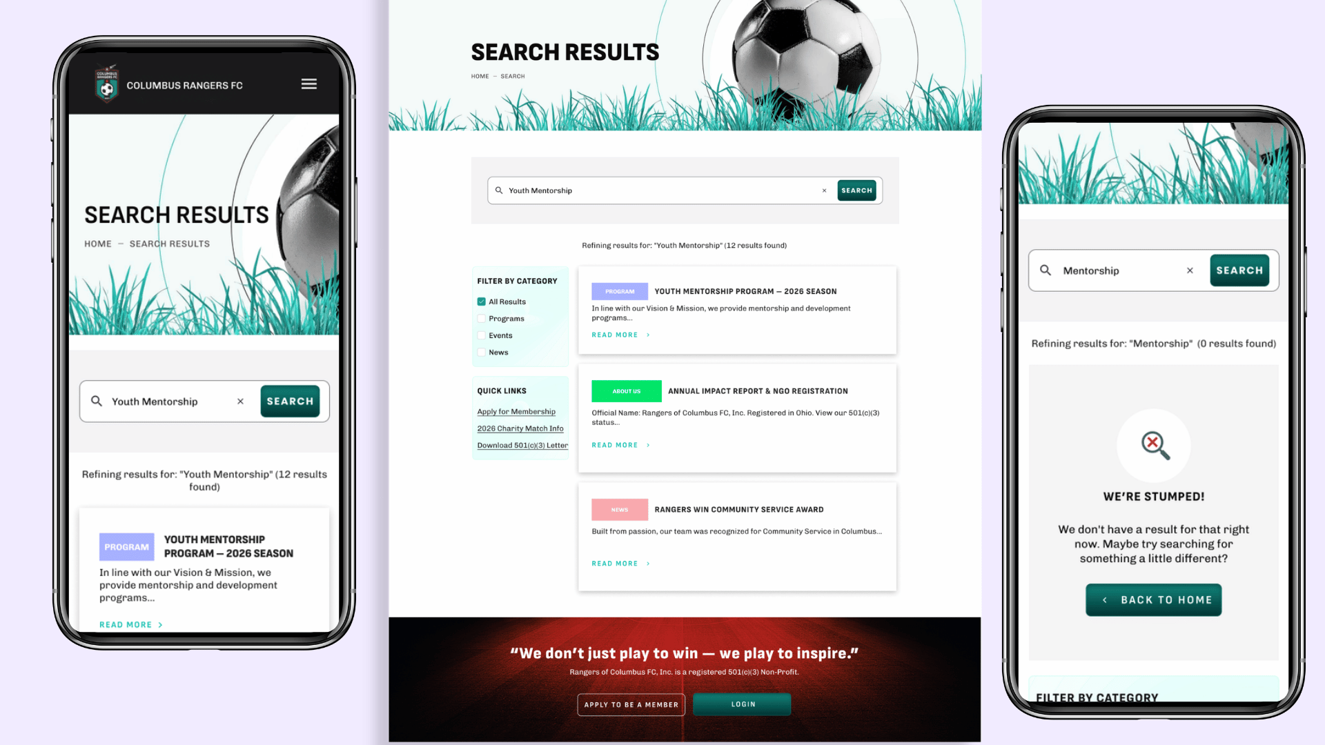
Below are selected screens I worked on as part of this project.
My Process
Understanding the Product & Users
Following the initial project briefing, I worked to understand both sides of the platform:
Public users (visitors, members, supporters)
Internal users (administrators managing the system)
I asked clarifying questions and aligned with the team to ensure a clear understanding of the requirements before moving into design.
Research & Exploration
I conducted focused research to guide my decisions, including:
Best practices for content-driven website pages
Usability patterns for dashboards and admin tools
Effective handling of user states such as search results and empty states
This helped shape how information was structured and how users interact with each screen.
Wireframing & Iteration
I created low-fidelity wireframes to define layout, hierarchy, and user flow across both website and dashboard screens.
These wireframes were shared with the team for feedback and iteration, ensuring alignment before moving into visual design.
Manage Suggestions Overview
Manage Suggestions Details
High-Fidelity Design
After validation, I translated the wireframes into high-fidelity mockups, focusing on:
Clean and consistent visual design
Clear content hierarchy
Ease of navigation for both public users and admins
Outcome
The final designs contributed to a more intuitive and cohesive platform, improving how users access information on the website and how administrators manage interactions within the dashboard.
